No part of this story can be reproduced without permission from 8days.sg.
If your social media feed has been flooded with Primary 1 registration content lately, you’re not alone Yes, it’s the season where Singapore parents eager to enrol their kids into their schools of choice suddenly transform into part-time data analysts.
One minute they’re comparing schools or deep-diving into balloting phases, the next they’re debating if living 0.99km versus 1.01km away from a school affects their chances, or wondering if moving house could improve their child’s odds of getting in to their preferred school.
One Singapore property agent figured there had to be an easier way and designed a free map to help parents in this process.
Speaking to 8days.sg, Ronald Lam (@heyronaldlam), a father of three boys, says Primary 1 registration was something his own family has had to navigate.
The property agent tells us that after years of clients asking him the same questions (Which school? Is being within 1km really worth it? Should we move?), he realised many parents were making one of the biggest financial decisions of their lives based on hearsay and forum threads.
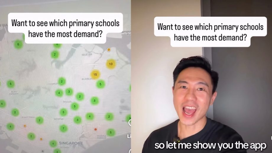
Enter P1 Registration Explorer, a free web-based tool combines years of Primary 1 registration data, school balloting history and nearby property information into a single interactive map built by Ronald, who shared the news on Instagram recently.
“I spent 15 years in high-frequency trading, so my instinct was simple. Put the actual data in front of people, and then let them see it for themselves,” Ronald tells us.
Just search for a school on the map and you will immediately see its 1km and 2km enrolment zones, making it much easier to visualise which homes fall within the distance bands used during the Primary 1 registration exercise.
“An explainer [on social media] answers one question for everyone. A tool lets every parent answer their own question for their own school, neighbourhood and budget,” he says.
The map also displays historical balloting data, allowing parents to see how competitive each school has been over the past seven years instead of relying on reputation, hearsay or WhatsApp forwards (yes, we have seen them in our group chats).
Perhaps the biggest surprise came after Ronald finished compiling years of MOE data.
Read Full Article At Source